Web App
ConnectWell
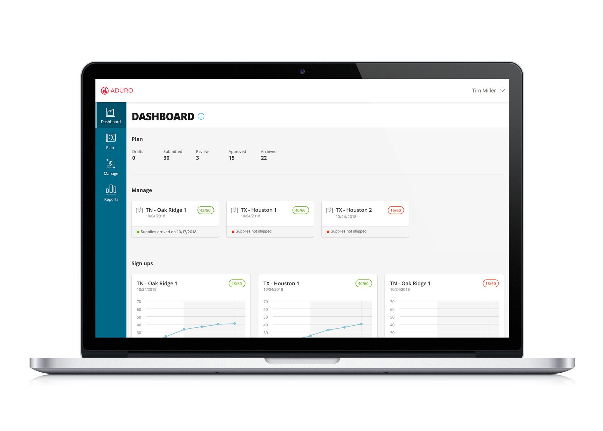
Web system for ADURO clients, WellMetrics team and Account Managers for creating, scheduling, managing and reporting on biometric screening events.
Role
Research
Design
Delivery
Problem
ADURO's Wellmetrics business offers biometric screenings to clients to measure employee health. As the business grows and matures, we face challenges with scaling. We currently process about 150,000 biometric scores a month, and 50,000 scores a quarter from ADURO onsite screening events. ADURO can have up to 20 events a day in any part of the country, which is logistically challenging as well. Pain points come from current tools on old tech stack and inefficient and dated internal processes.
A massive overhaul to the company’s workflows and tools was required to ensure scalability and support year over year growth while keeping overhead costs low. Due to the size of this project, and its impact on an extremely important part of the business, we split into two phases.
The MVP
Introduction
In this project phase, we were handed an aggressive deadline (about a month) to get an MVP scoped and designed, so most value for least time was key.
We focused on the process of clients scheduling these biometric screenings, which was identified as becoming unmanageable. Massive excel sheets with multiple drafts and versions were being passed around between clients, account managers, and our Wellmetrics event managers.
I narrowed scope to: How might we design a web based tool for ADURO Clients, Account Managers and Event Managers that improves the current workflow for biometric screening event scheduling, while building the foundations of future event planning functionality?
Research
The first step was understanding the currently process, identify stakeholders and responsibilities: Clients, Account Managers and Wellmetrics Event Managers.
To understand the current workflows, I created diagrams after consulting with the WellMetrics business leader and the product manager.
Current workflow and opportunities
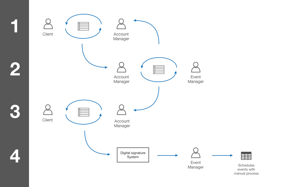
The old workflow had clients submitting event requests on a complicated, messy Excel sheet to their Account Manager, and they would email back and forth, then pass off to an event manager and… it was inefficient. With hundreds of events a month, the sheer volume of work, errors, and frustrations compiled.
Revised workflow
We recognized that with a proper submission and approval system, inclusion of the Account Manager was typically unnecessary. Additionally, if we had an approval process from the client, we wouldn't need to use third party digital signature software. Below became the new standard workflow.

Stakeholder goals
I did not feel the need to intensely formalize personas due to having 2 of the 3 user groups available for consulting at any time. Instead, I simply put together some high level goals to keep in mind:
Client
- Plan WellMetrics Events
Event Manager
- Manage and approve events
Account Manager
- Act on behalf of client if necessary
Ideation and prototyping
Due to our expedited timeline, we had to focus on creation and stakeholder buy-in as quickly as possible. After hitting the ground running by sketching some very basic ideas and information to be included with the product manager, I jumped into low fidelity interactive mockups with Sketch + Invision to establish new workflows and review with stakeholders.
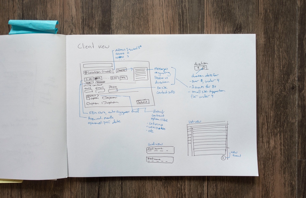
Initial collaborative sketch
By working through possible layouts and information needed to be included with the product manager, we were able to synthesize the information we had been collecting. It may not look pretty, but it was instrumental in aligning vision:
Low Fi Mockups
Transitioning away from submitting 100+ events at once for the entire year brought with it the effect of allowing a rolling event submission for our clients. I was excited about this opportunity and tried to design around that shift in paradigm, offering an interface that emphasized each event was individual and could be dealt with on its own.
I learned through evaluating this prototype that actually lead to a clunky experience for clients with hundreds of events. Also included in the low fidelity mockups that did not make their way into the final version is cost estimation per event – What seemed like a straightforward pricing model actually was dependent on many factors we deemed too time intensive to work through on the MVP. However, the feature received great feedback, putting it on the roadmap for future iterations.
Design and documentation
After rounds of feedback, I had a good idea of what the final design should look like. Taking that into account, I created a design guide for developers to follow alongside the high fidelity mockups for final revisions and developer communication. This version has been picking up some extra features along way after it’s initial design and release.
ConnectWell
Introduction
With the event scheduling worked through, we had a release that would help the WellMetrics team in the short term while we executed on the longer term vision. This would encompass far more scope and move us off our current tech stack.
The capabilities to be added centered around:
- Shipping and logistics tracking
- Staffing and management
- Participation reporting
- Event communications
Design Principles
Based on prior research and learning along the way, I created governing principles for this project. I checked most decisions I made against these, and they became somewhat of a success criteria as well.
- Standardization of process
- For this design to support growth, I wanted to use it to focus the WellMetrics team’s process and even client offerings to the most standard set possible.
- Ease of data entry
- A huge pain point of the original workflows, entering event information had to be as simple and technologically supported as possible.
- Matching the mental model
- Current technology and processes do not support how the team actually thinks about everything involved with events.
Stakeholder goals
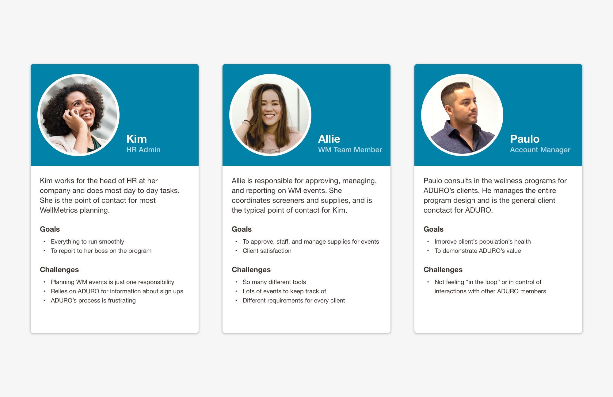
Stakeholder’s goals expanded to the full lifecycle of an event – here are their goals presented as personas.
Lifecycle of an event
Because of the scope increase, I worked with the WellMetrics team to understand and document the lifecycle of an event. This would prove to be extremely useful for me through the project and served as my primary research artifact.
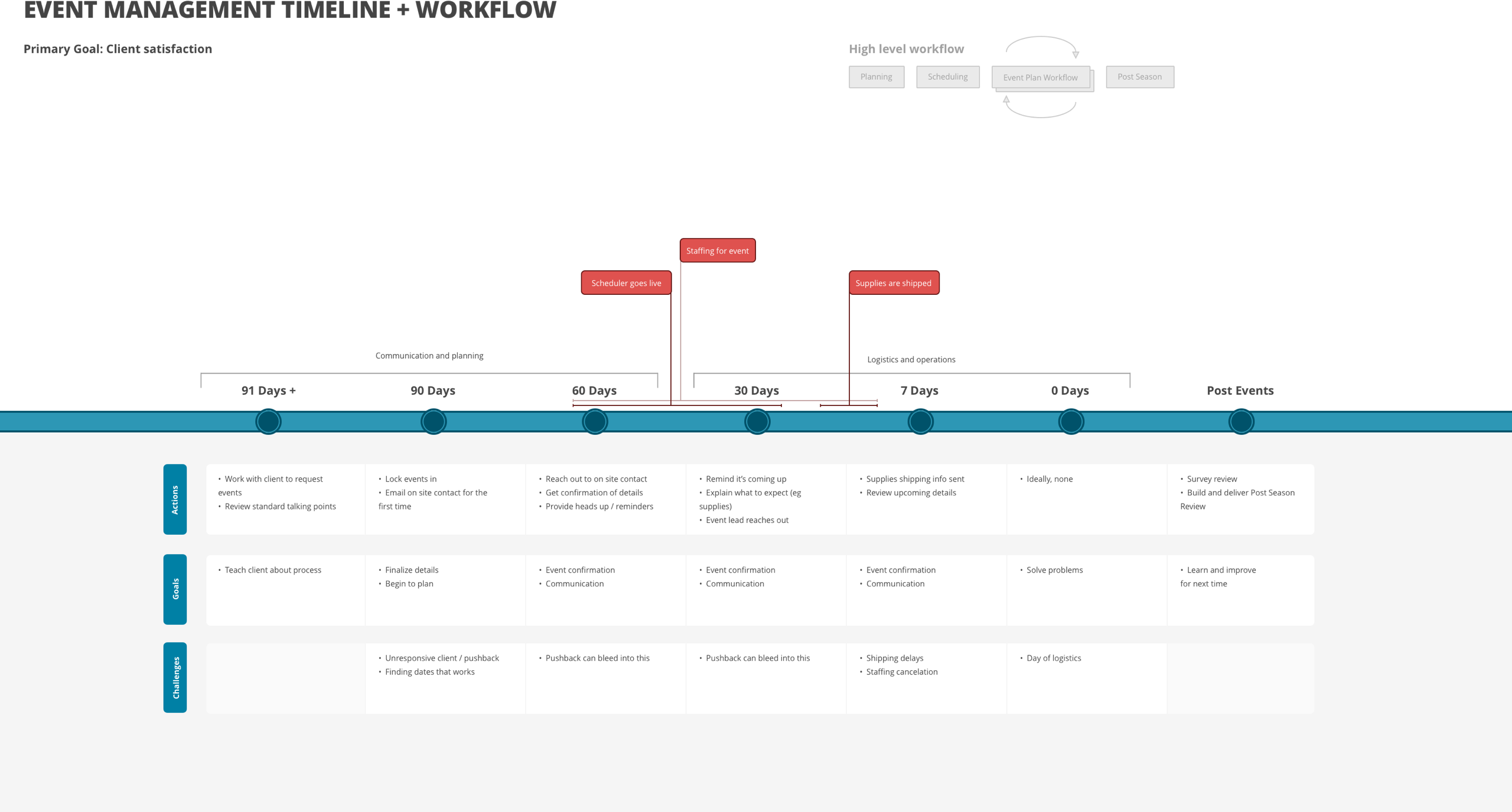
Exploration and prototyping
Information architecture
Early on I began experimenting with different ways I might structure the navigation with the additional features. I first though an information architecture structure that is focused around how an event moves from conception to completion makes sense. After interviewing event managers around their mental model, I realized they thought of events phases like “planning” and “managing”. Which lead me to organize as such.
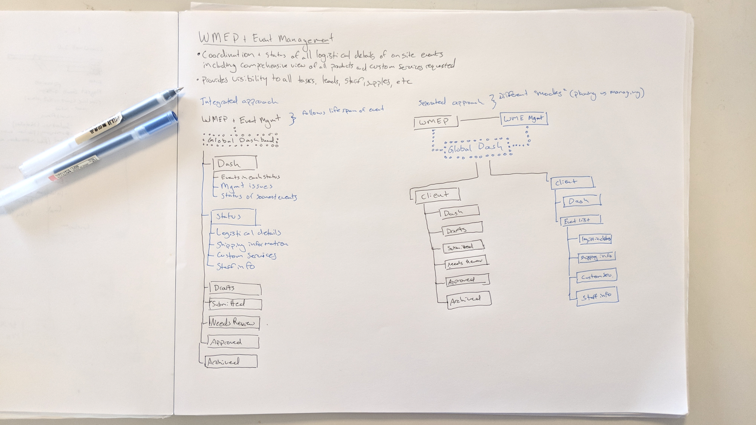
User flows and wireframes
I understood what the approval workflow looked like, but did not understand how it would fit into the rest of the system. To work through creating this, I paired low fidelity wireframes with user flows for client and event manager tasks.
High fidelity prototypes
Concurrently to this project, I had been creating a unified design system for ADURO - one to embody the voice, look and feel that our marketing team is responsible for in an efficient, reusable set of principles and components for product design across Web, Android and iOS platforms. That project deserves its own entry, but why this matters here is I could jump from wireflows to relatively high fidelity mockups quickly and easily using this new system.
After a few rounds of testing with stakeholders, I finalized the design. Below are the key interactions:
Final word
I learned a lot with the exercise of spacing out this product into MVP and full release. It let us hit the ground running and add value to the team while still scoping the project and giving us the time to dig into some of the more complicated probelms to release later.

